Take control over your watercolor composition with modeling. Today I want to very briefly talk to you about the concept of modeling. This is a topic that’s discussed nearly enough and yet, it holds the keys to understanding creative composition! Once you understand it a whole new world of creativity will open up to you.
The majority of students think about and paint exclusively the values that are dictated to them by illumination. Professionals and advanced painters usually choose this method of organizing their values because they appreciate light and its effects. On the other hand, many of the hobby painters are unaware of their choice at all and paint light by default, considering it to be the only way to paint.
This is natural. As one progresses and builds up experience and skill, slowly one figures out these things. Of course, painting the effects of light is an entirely valid way to paint. However, it is not the most creative way to paint. And certainly the results are often lacking in terms of composition because the approach lends itself to strong observational focus.
So, what is modeling? I mentioned that it is not painting of light. No light, no shade and no shadows. Many creative artists (me included) who do still somewhat representational/recognizable work are usually combining the two modes of rendering their subject/planes. They design their value patterns not based on the light effects, but independently of them, with the emphasis on good overall tonal rhythm. Afterwards they add hints of illumination such as shadows – not because they were there but simply because their shapes (often invented) help strengthen the composition as well as help make the piece more recognizable to the viewer.
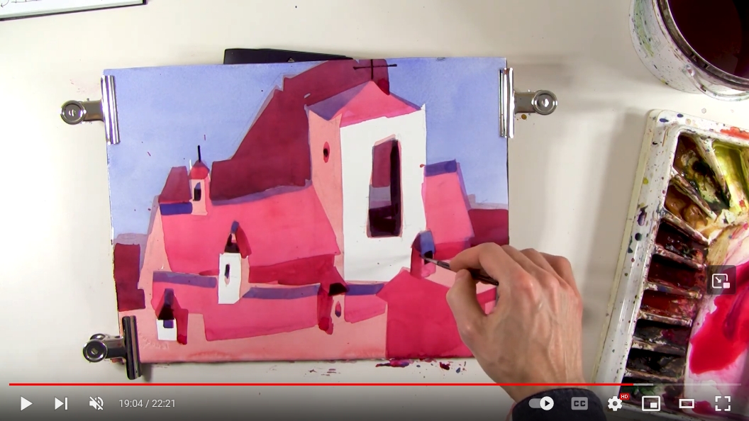
In today’s video I paint a very quick study demonstrating this approach. I refrain from including any shadow shapes so the concept reads as clear as possible. Were you to look for a source of light in this painting you would not find one. Notice that I explain planes by change of value. Not as a single light-source dictates it but arbitrarily – to create an overall interesting pattern of values. The white shapes are not white because they are illuminated by sun, I decided to make them white for the purpose of design. They are set as gemstones in a body of middle value. There are few darks placed sparingly – and intentionally – to add spark and vibrancy to the entire piece.