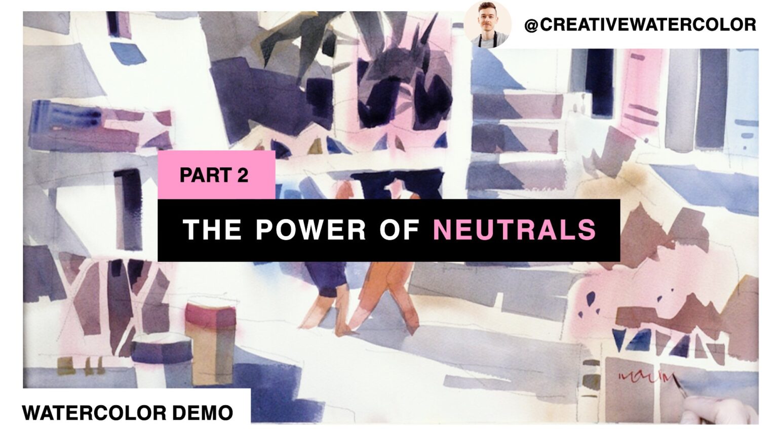
Power of neutral colors in watercolor painting is generally underrated, especially by the less experienced painter. In this demo we’re going to discuss how to employ the power of neutral colors.
POWER Of NEUTRAL Colors In WATERCOLOR Painting - Material List
Paints
- Winsor & Newton Winsor Yellow
- Winsor & Newton Winsor Yellow Deep
- American Journey Halloween Orange
- Daniel Smith Pyrrol Red
- Winsor & Newton Permanent Rose
- Winsor & Newton Permanent Alizarin Crimson
- American Journey Joe’s Green
- American Journey Cerulean Blue
- American Journey Cobalt Blue
- Winsor & Newton Winsor Blue Green Shade
- Holbein Permanent Violet
Brushes
- Winsor & Newton One Stroke Sable ½”
- Winsor & Newton Series 995 Synthetic 1″
- Robert Simmons Skyflow Synthetic 2″
- Robert Simmons Skyflow White Sable 1½”
- Rosemary & Co Pure Sable Series 90 #6
Paper
- Saunders Waterford 140lb Cold Press, 15″ x 22″
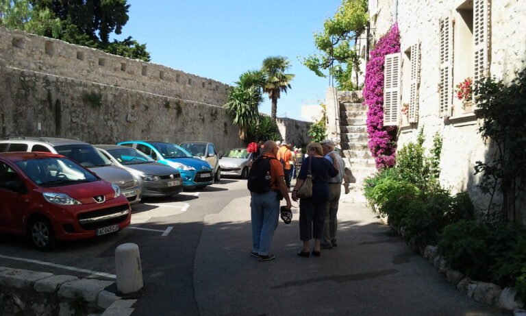
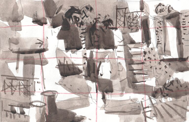
POWER Of NEUTRAL Colors In WATERCOLOR Painting - Reference Images
POWER Of NEUTRAL Colors In WATERCOLOR Painting - The Lesson
Hello everyone and welcome back to my studio.
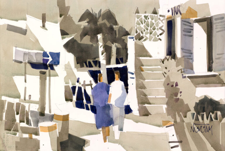
In the previous video we started our painting with a soft wet into wet wash. This wash serves as our underpainting. I find that starting a painting this way simplifies the process because it deals with two structural elements early on: it established a general color scheme on which it’s easier to build and it isolates the pattern of whites.
I also mentioned the kind of inspiration that went into this work. The ideas of lightness, jewel-like patches of color, dancing musical notes and poetic characteristics are all thoughts and impressions I’m trying to work into this painting.
Let’s first have a look at my approach to color. The underpainting wash indicates how I decided to work with color in this painting. If you appraise the painting’s color thus far, you can see clear patches of pure, intense blues and pinks. These colors are placed around the painting in such a way as to create a nice balanced pattern. Their placement is also considered in terms of their relative importance. I place the bright patches of color around the composition to draw the eye out of the center of the painting and help the viewer rotate around it. This helps me counterbalance my figures which I daringly decided to place in the middle of the composition. Placing color strategically around the composition helps induce movement based on color intensity.
The trick in making these bright patches stand out and easy to follow for the viewer lies in surrounding them by neutral color. Neutral doesn’t mean ‘without color’. Notice how my neutrals are also varied in their temperature and intensity. I have yellow-leaning neutrals, green and blue ones and those that are almost gray.
All of this variety adds interest which is very important. This trend continues in my treatment of the middle value. This is painted over dry paper with all-hard edges. This creates another layer of contrast, soft against hard.
As for color, you can see how I use bright colors in some areas whereas I mix colorful neutrals elsewhere. Here the idea again is one of balance. Painting neutral colors only helps the bright ones stand out more, spark brighter and feel more important.
In terms of technique there’s a few points I’d like to highlight. Notice how I’m continuously moving around the composition. I don’t focus excessively on a single part of the painting. I rotate around, bringing it to completion gradually as a whole. This assures that I don’t overwork certain parts of the painting.
Another technical aspect of this work lies in my use of distinctive brushwork. This painting makes use of the calligraphic qualities that watercolor offers. Strokes are made visible, either as little dots, triangles or shapes that are reminiscent of a stroke of a brush.
Another idea I’m utilizing in this painting is disconnection. Usually I stress the importance of connecting your washes, which teaches good structure and leads to unified paintings. Here I intentionally paint smaller shapes in a fairly disconnected manner. I want to bring about the airiness, looseness and joyfulness of the French Riviera.
Finally, notice how I’m keeping my values on the lighter side. I don’t want to overpower my subtle color variations established thus far. We discussed the ideas behind colorist and tonalist approach in the previous video and the idea of suppressing value is applied in this stage of the work. The more variety inside middle value I can introduce the better and richer the painting’s overall color scheme will be.
That is all for today’s lesson. I hope you enjoyed. In the final video in the series we’re going to discuss figures and how to seamlessly introduce them in a landscape painting. If you enjoyed today’s video please leave a like, comment and subscribe and I’ll see you in the next one!