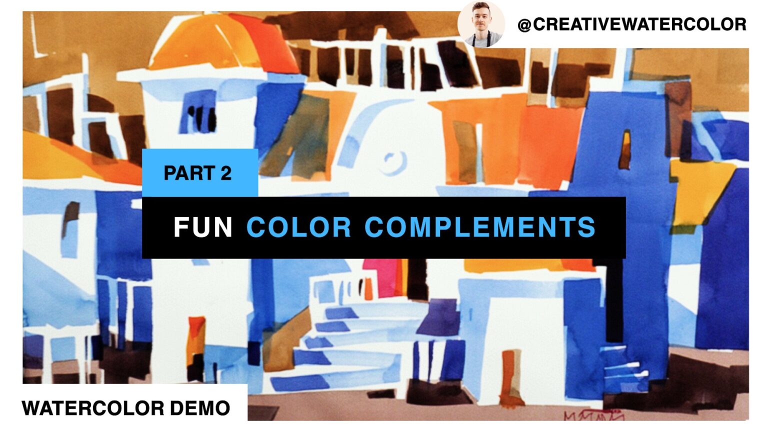
Make your watercolors fun using complementary color. Properly utilizing complementary colors leads to strong color scheme that is colorful yet balanced. Learn to use complementary colors in this video lesson.
Make Your Watercolors FUN Using Complementary COLOR - Material List
My Palette
- Winsor & Newton Winsor Yellow
- Winsor & Newton Winsor Yellow Deep
- American Journey Halloween Orange
- Daniel Smith Pyrrol Scarlet
- Winsor & Newton Permanent Rose
- Winsor & Newton Permanent Alizarin Crimson
- American Journey Joe’s Green
- American Journey Cerulean Blue
- American Journey Cobalt Blue
- Winsor & Newton Winsor Blue Red Shade
- Holbein Permanent Violet
Brushes Used During This Painting
- Winsor & Newton One Stroke Sable ½”
- Winsor & Newton Series 995 Synthetic 1″
- Robert Simmons Skyflow White Sable 1½”
Painted On Paper
- Saunders Waterford 140lb Cold Press, 15″ x 22″
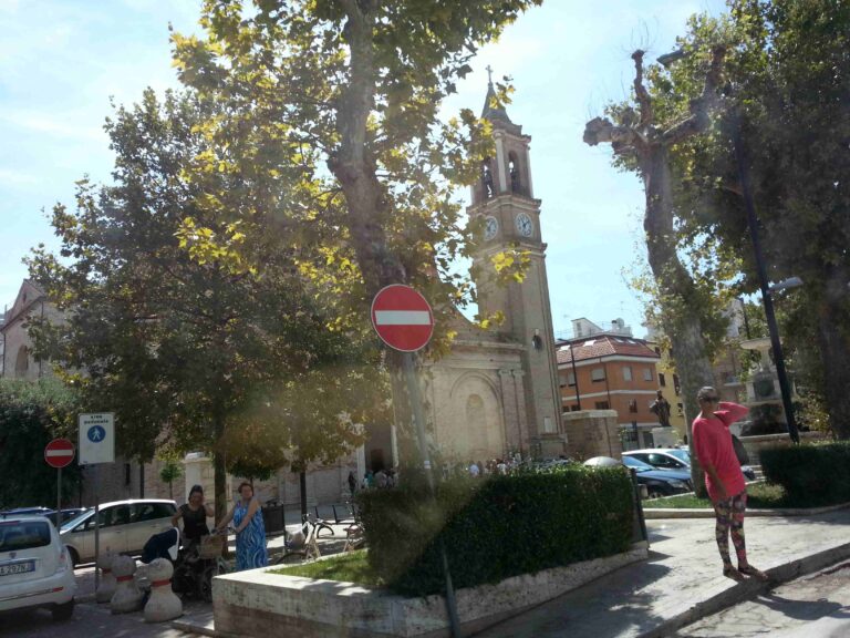
Make Your Watercolors FUN Using Complementary COLOR - Reference Images
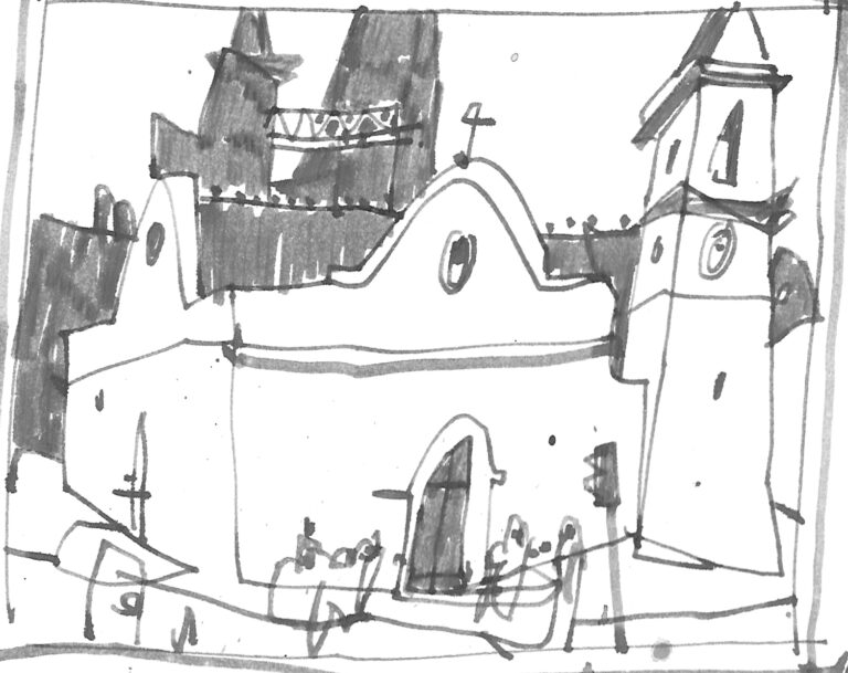
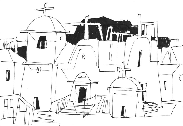
Make Your Watercolors FUN Using Complementary COLOR - The Lesson
Hello everyone and welcome back to my studio. In the previous video I started my painting off by focusing exclusively on the shadow pattern, which features very prominently in this painting.
I painted the shadow pattern with cool colors only. I used a light blue wash and a slightly warmed up middle value blue wash to create a foundation for my church structure.
The focus of today’s demo is to introduce colors that pair well with the cool blue washes and lead to interesting and fun color harmony.
Of course, you already know from the title of today’s lesson that we’re going to discuss complementary colors. The theoretical aspect of complementary colors could be defined as follows:
- Complementary colors are two colors that produce the most dramatic color temperature contrast. The default pairings are blue and orange, yellow and violet and green and red.
- Complementary colors are two colors that produce a range of neutrals upon mixing.
These statements are an oversimplification, but for the purposes of today’s lesson, they’ll suffice. As you can see, I don’t have any earth colors on my palette. The advantage of a palette consisting only of bright colors is that maximum intensity can be achieved if desired.
But there is a danger of not having readily available neutralizing color (such as Burnt Sienna or Ochre) – especially for a beginner. The beginner often struggles in this respect and may end up with a painting blown out of proportion through overuse of intense colors.
Grays can be mixed from bright colors but it’s not as easy or fast as using a ready-made neutral color. Some pigments also don’t mix well or don’t produce particularly pleasing neutrals. Abusing a color like Burnt Sienna isn’t necessarily desirable long-term but it’s a good way to get the hang of incorporating neutrals.
It’s worth pointing out that I work with the concept of complements without using two direct complementary paints. I mix my orange from two bright colors: yellow and red. I also use these two colors pure, thus adding variety to this complementary color scheme, expanding the warm side of the spectrum. My painting isn’t purely orange and blue, that can be boring.
As I paint, I keep in mind the big picture: I make sure that I don’t paint everything with bright colors but neutralize my washes along the way. I want to have a nice mix: I want enough neutral colors so that they make the bright colors stand out.
Please note that using complementary colors doesn’t mean producing a colorless painting. After all, the title of today’s lesson includes the word ‘fun’, but keep in mind that balanced painting is a painting that has a variety of color hues, temperatures and intensities.
Experiment with these ideas. You can apply them whether you use three-color palette or have a full 15-color palette. You can use them regardless of the paint brands you use or the particular composition of paints. Use complementary colors to make neutrals, utilize their strong contrast sparingly in certain strategic places. While you don’t need two direct complements, working with two paints leads to easier mixing of your neutrals.
I hope this discussion helps you better understand color and the presence of neutrals in your paintings. If you enjoyed the video, please like, comment and subscribe and I’ll see you in the next one.

