
How to use limited palette in watercolor? Find out in today’s video.
Hello friends and welcome back to my studio!
I invite you to join me for this final video in the Scottish coastline demo series. In the previous two videos we discussed at length watercolor paper quality and how can paper affect your learning process.
I would like to preface this final episode by saying that #1 – an experienced artist can overcome any difficulty imposed upon their practice by materials. It isn’t necessary to seek the best of the best. But watercolor is a fairly demanding medium and I find that paper is one of the factors that can considerably help or hinder one’s learning. #2 – I’m by no means an expert on watercolor paper. All my findings come directly from my painting practice, experimentation, trial and error and as such are simply observations.
I dedicated both previous videos in the series to the discussion of paper. That’s why I’m going to focus more on the actual painting in this video. Let’s analyze our painting a little closer now.
Color
Notice that this entire painting I painted with only three paints. These are: Halloween Orange and Joe’s Green by American Journey, and Permanent Violet by Holbein. The list of paints I use is not set in stone. I’m always using what I have available at that moment. For example, Permanent Violet by Hobein wouldn’t be my first choice in respect to quality but because it’s more affordable than the one I prefer made by Winsor & Newton, this is what I use.
If you’re interested to find alternatives to these paints that are available to you, here’s a pigment list for each paint:
- Halloween Orange: PO62
- Permanent Violet: PV23
- Joe’s Green: PG7
These three paints are what we call secondary colors. But what’s more important than hue is that this palette contains a light-valued color (orange) and two dark-valued colors. Together, they provide good value range coverage. Often beginners who try a limited palette make the mistake of not having a wide enough range of values available to them. If you, say, use Lemon Yellow, Rose Red and Cobalt Blue, you can’t possibly mix darks because your paints only reach up to middle value. As such your painting’s value range will suffer by not having any darks at all. Always choose a palette with which you can cover a wide range of values, from light, through middle to dark.
Pattern
In terms of the big picture, let’s consider my color pattern. Notice how my warm colors are surrounded by cools. The painting is certainly cool-color dominant, which makes the warm main building stand out. Notice that I used a lot of neutral mixtures as well, which are very important because they provide relief. These are important especially on the outside edges of the painting where we don’t want strong visual pull.
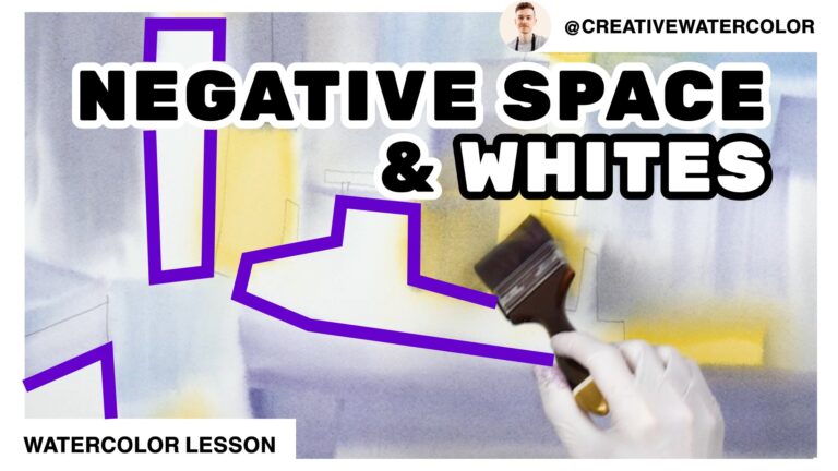
In terms of value pattern, notice how the white pattern fits together with the middle values. They’re like yin-yang symbol, the positive middle-value silhouette fits around the negative white pattern.
Technique
I started my painting by wetting my paper and painting wet into wet. This resulted in a soft, diffused underpainting. This underpainting established my basic structure of the piece as well as its color scheme. You can re-watch the first video in the series where you can observe how exactly I do that.
Then in the second video you can see how I create the big middle-value pattern by painting it over the soft underpainting wet on dry. This creates a nice textural contrast (hard vs. soft edges) and helps soften the white shapes. The reason this works well is that the whites in this painting are fairly large and as such benefit from having soft transition towards the middle values.
And that is all for this week’s demo. I hope you enjoyed the series.
If you have any questions or comments, please leave them below the video. If you enjoyed the video, please leave a like and subscribe and I’ll see you next week!
PS: don’t leave yet, stay for the bonus footage!