
How to learn color in watercolor painting? Let’s dive deep into the topic in this video watercolor demonstration lesson and discover the principles behind using color.
How To LEARN COLOR In Watercolor Painting - Material List
My Palette
- Winsor & Newton Winsor Yellow
- Winsor & Newton Winsor Yellow Deep
- American Journey Halloween Orange
- Daniel Smith Pyrrol Red
- Winsor & Newton Permanent Rose
- Winsor & Newton Permanent Alizarin Crimson
- American Journey Joe’s Green
- American Journey Cerulean Blue
- American Journey Cobalt Blue
- Winsor & Newton Winsor Blue Green Shade
- Holbein Permanent Violet
Brushes Used During This Painting
- Winsor & Newton One Stroke Sable ½”
- Winsor & Newton Series 995 Synthetic 1″
- Robert Simmons Skyflow White Sable 1½”
Painted On Paper
- Saunders Waterford 140lb Cold Press, 15″ x 22″
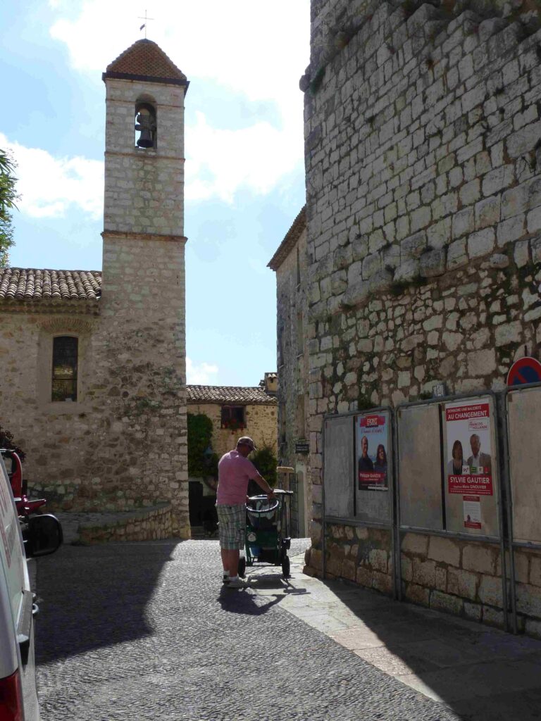
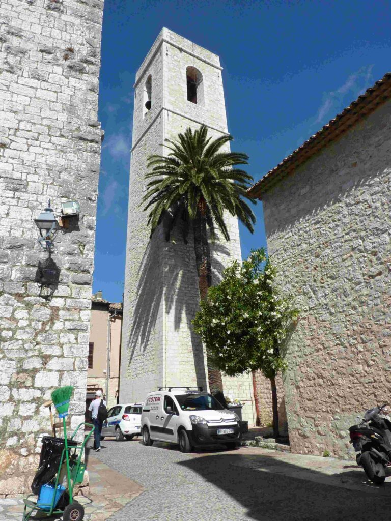
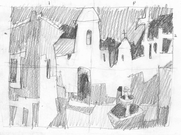
How To LEARN COLOR In Watercolor Painting - Reference Images
How To LEARN COLOR In Watercolor Painting - The Lesson
Hello friends and welcome back to my studio!
In the third and final part of this week’s painting we’re going to ponder the question ‘How to learn color and use color strategies?’
There are no absolutes when it comes to color application in painting. Color in painting is evolving and changeable. This relative quality of color allows us to react to what’s happening on the paper and adjust our approach accordingly.
The overarching idea in any one painting is dominant color. Generally speaking, painting should be predominantly warm or cool. That means that a painting should contain a majority of cool color notes and a minority of warm color notes or vice versa. Mix in some neutrals to show off these two ends of the spectrum and you should end up with a balanced and pleasing color statement.
Our idea of general color dominance is what keeps us on the right track throughout the painting process. But what about the decisions we make along the way?
I propose that we look at two ideas that may help us get things done well: color sense and color harmony.
A good way to deal with the individual color decisions is by following the principle of harmony. Harmony assures that we’ll have a clear path in front of us. If unsure about which color to use, I look at my painting and note the colors already present. Then I can make an informed decision.
If I have enough contrast, that is intense warms and cools, I can add neutrals. If I lack pure warm colors, I add some to restore balance. If I have plenty of pure colors on both sides of the spectrum, I can consider adding neutrals (grayed down pure colors).
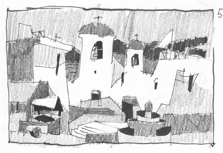
Observe an example of such decision-making in this painting. You can see how I paint my ground plane with a muted warm color and my sky plane with a muted blue. The reason I pick muted/neutral colors is because I have enough pure colors and I need these neutrals to make them stand out. The other reason why I chose muted yellow/brown and muted blue in particular is, of course, harmony. I work with the color scheme already established and expand upon it.
Choosing a completely different hue, such as green, would be a mistake at this stage. The green would stand out like a sore thumb. What’s more, because green doesn’t relate to any other color note on the page, it would completely unmake my color harmony.
Depending on how far into the painting you are, this can either set you back or outright kill your color. I recommend that you follow the principle of harmony and introduce notes that echo the colors you already have in your painting. Add some slight spin on them to assure variety, and if you have plenty of pure, bright colors, offset them with some neutral colors.
Finally, your sensitivity and perception of color is unique to you. Your color sense evolves with practice and with better understanding of color properties and relationships. As long as you follow the higher principle of establishing color dominance first, then work towards variety through harmony, the rest will take care of itself.
I hope you enjoyed this week’s painting. I sure enjoyed painting it for you. If you liked the video and learned something new, consider leaving a like, commenting and subscribing to my channel. It all helps a great deal. I wish you happy painting and I’ll see you in the next one!