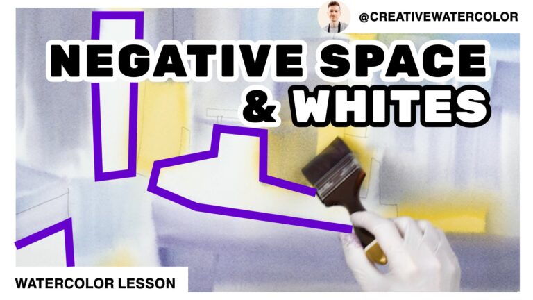
How to control color intensity in watercolor. This lesson explains how I approach color strategy that utilizes color intensity.
How To CONTROL Color INTENSITY In Watercolor - Material List
My Palette
- Winsor & Newton Winsor Yellow
- Winsor & Newton Winsor Yellow Deep
- American Journey Halloween Orange
- Daniel Smith Pyrrol Scarlet
- Winsor & Newton Permanent Rose
- Winsor & Newton Permanent Alizarin Crimson
- American Journey Joe’s Green
- American Journey Cerulean Blue
- American Journey Cobalt Blue
- Winsor & Newton Winsor Blue Red Shade
- Holbein Permanent Violet
Brushes Used During This Painting
- Winsor & Newton One Stroke Sable ½”
- Winsor & Newton Series 995 Synthetic 1″
- Robert Simmons Skyflow White Sable 1½”
Painted On Paper
- Saunders Waterford 140lb Cold Press, 15″ x 22″
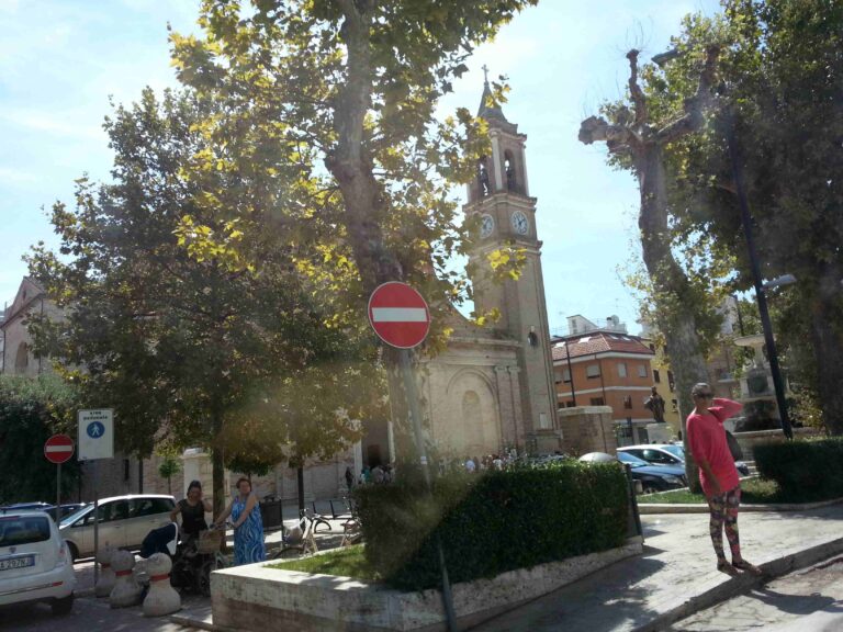
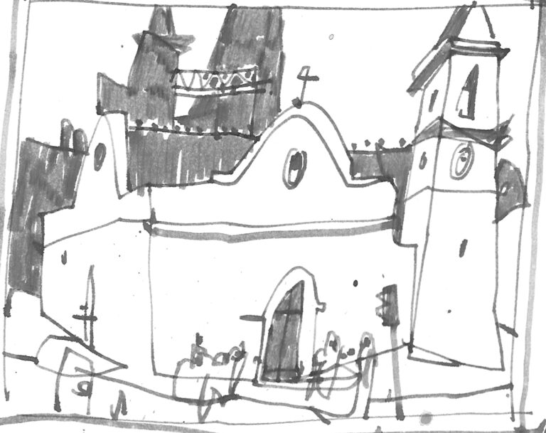
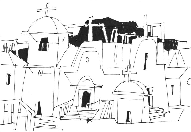
How To CONTROL Color INTENSITY In Watercolor - Reference Images
How To CONTROL Color INTENSITY In Watercolor - The Lesson
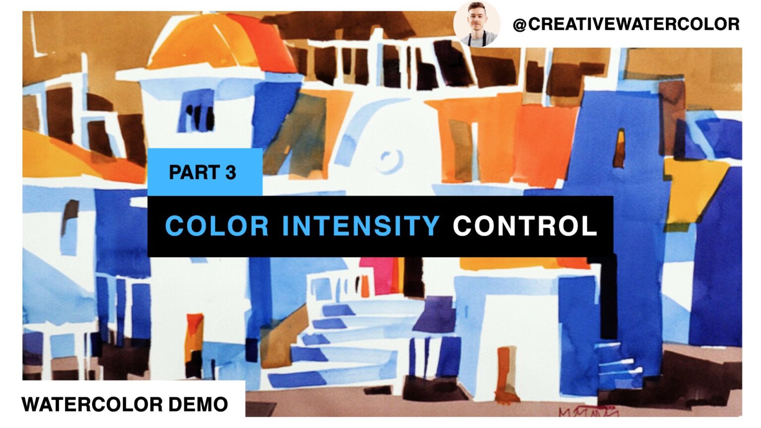
Hello friends and welcome back to my studio. In this final video of this week’s demo painting we’re going to focus on color intensity control.
Color intensity is an important component of working with color. Neutrals are critical in establishing a balanced color statement. Every painting needs a mix of bright colors and neutrals. All bright colors are overwhelming just as all grays lack interest.
Think of using color in terms of storytelling. Use bright colors as accents or highlights inside a story. Use it to say: “Look here!” Bright color signifies that something’s happening in that area and is more important than other areas.
If you lack grays there’s just no way to have this internal hierarchy and the painting is all action. Neutrals are generally used to create areas of rest, both visual and conceptual.
Note that “neutral” doesn’t mean colorless. Colorful grays read as color, yet still show off bright colors. These neutrals are easily relatable to the rest of the painting, especially if mixed from colors already used in the painting.
In practical terms my color decisions in this painting go as follows. First I must decide whether I want my painting warm or cool color dominant. Because the painting features a very prominent shadow pattern, which will be painted blue, I choose warm color dominance.
I first establish my shadow pattern and then start building the rest of the painting using almost exclusively warm colors. This makes the shadow pattern stand out. I use bright reds and oranges as highlights on the roofs and windows/doorways. I finally paint my sky and ground planes using neutral warm colors, which tone down the “colorfulness” of the painting, balancing out the color expression. Darks are painted using darker versions of these grays. The darkest accents are placed sparingly around the composition.
And that’s all for today’s lesson. I hope you enjoyed this week’s painting and the accompanying lessons. If you learned something new or have further questions, please leave a comment below the video. If you enjoyed the video like, comment and subscribe and I’ll see you in the next one.