In this advanced watercolor painting lesson you’ll learn how to make your paintings readable!
Readability in art is assured by the correct use of light and dark principle. The contrast of light and dark is superior to color identification. Make your painting monochrome and you’ll see that if you use correct values, the painting will read well without a drop of color.
In a painting scenario we often forget that this is the case and we sometimes get overwhelmed by color. When we use color in this way we no longer perceive value and forget that what makes our painting readable is actually TONAL VALUE, not color. Color does play a role and it does increase contrast if used correctly, but without the underlying structure of tonal value, color itself can only do so much.
Join me in this advanced watercolor video lesson and learn how I apply this concept in my recent watercolor painting. In this video you’ll learn and understand how the utilization of CONTRAST (of tone and color) helps you make stronger paintings. I refer to this contrast control as PUSH & PULL.
Learn to use this concept in your paintings and you’ll be amazed at the results! Enjoy!
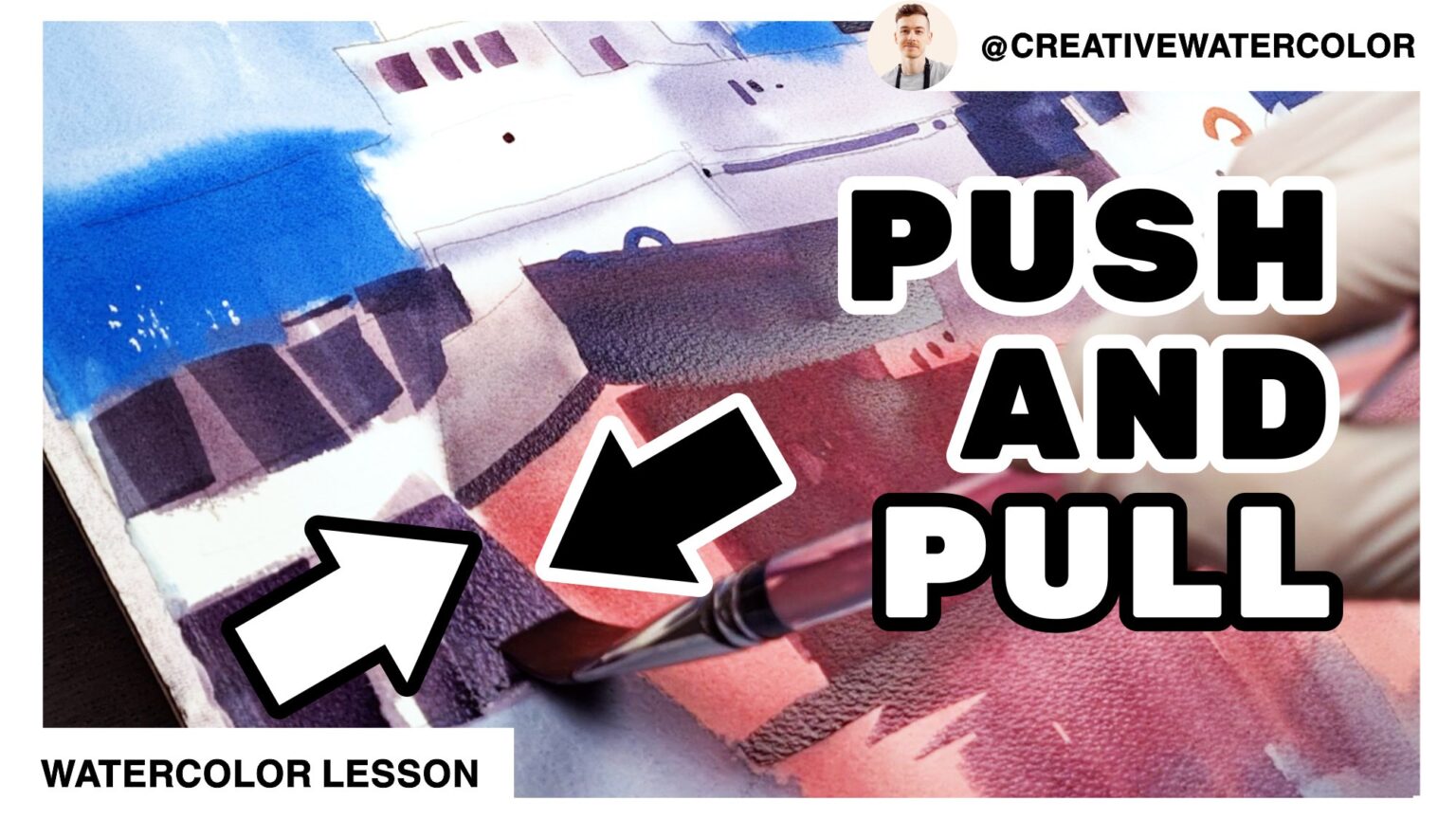
Control PUSH & PULL Through Color And Value - Video Lesson
Control PUSH & PULL Through Color And Value - Transcript
Hello everyone and welcome back to my studio. Today’s lesson is based on my latest demo and if you haven’t watched it yet, I encourage you to do so.
Now onto our lesson. I want to share with you some ideas on push and pull control in your paintings.
One way to direct organization of shapes in a composition is through the principle of push and pull. This push and pull mechanic tells the viewer where in space are objects located and also where they are located in relation to each other. Today we will see this principle in action through value and color control.
We got 2 examples of this principle here…
In this first example we’re looking at the utilization of value, which means that contrast is created through the use of light and dark. Notice that I paint the port building in the background as a dark value. This is not because the building was dark. It’s because making the building dark helps push the building to the background while pulling the ships forward.
I also use color intensity here, which means that I put brighter colors next to more neutral colors to create separation, or distinction, among these shapes. This works well when you have two shapes that are similar in value, in which case you can’t really rely on tonal contrast to explain where one ends and the other stars.. You can see this intensity contrast in the background building, which is dark and cool and somewhat neutral in color and the shaded plane of the ship’s control tower, which is very similar in value. In this case I use here a brighter blue so that the two shapes don’t visually merge together despite both shapes having similar tonal value.
In this second example I paint the quay next to the ship’s hull on the left hand side of the painting. The hull is a light, warm color. I paint the quay using a darker value and I use neutral color which is also much cooler than the red hull. This section of the painting utilizes color temperature contrast, color intensity contrast and tonal value contrast. You can see this in the warm red of the ship’s hull against a cool blue of the quay, the quay is also neutral while the hull is fairly intense in comparison. The quay is also dark, the hull is light.
That’s all for today. If you enjoyed the lesson, please leave a like, comment and subscribe to my channel and I’ll see you in the next one.
Control PUSH & PULL Through Color And Value - Material List
🎨 My Full Palette 🎨
🟡🟠🔴 Warm colors
Winsor & Newton Winsor Yellow
Winsor & Newton Winsor Yellow Deep
American Journey Halloween Orange
Daniel Smith Pyrrol Scarlet
Winsor & Newton Permanent Rose
Winsor & Newton Permanent Alizarin Crimson
🟢🔵🟣 Cool Colors
American Journey Joe’s Green
American Journey Cerulean Blue
American Journey Cobalt Blue
Winsor & Newton Winsor Blue Red Shade
Holbein Permanent Violet
🟤⚫⚪Earth & Neutral Colors
None ATM
🖌️ My Brush Set 🖌️
Winsor & Newton One Stroke Sable ½”
Winsor & Newton Series 995 Synthetic 1″
ProArte Renaissance Sable 1″
Robert Simmons White Sable 1½”
Robert Simmons Skyflow 2″
Rosemary & Co. Pure Sable Ser. 90 Liners
🖼️ Paper Used In This Demo 🖼️
Saunders Waterford 140lb Cold Press, 15″ x 22″ / 38 x 56 cm