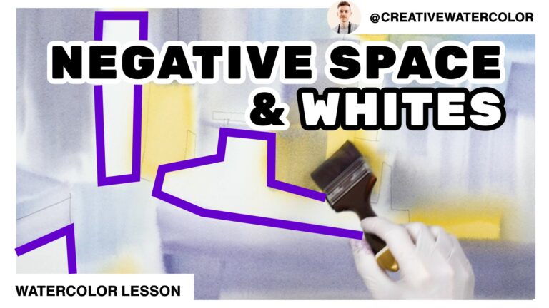
Secrets of negative painting in watercolor. In this video lesson you’ll learn to look at shapes in terms of positive and negative. Develop your skill of negative painting and improve your paintings!
Secrets Of NEGATIVE Painting In WATERCOLOR - Material List
My Palette
- Winsor & Newton Winsor Yellow
- Winsor & Newton Winsor Yellow Deep
- American Journey Halloween Orange
- Daniel Smith Pyrrol Red
- Winsor & Newton Permanent Rose
- Winsor & Newton Permanent Alizarin Crimson
- American Journey Joe’s Green
- American Journey Cerulean Blue
- American Journey Cobalt Blue
- Winsor & Newton Winsor Blue Green Shade
- Holbein Permanent Violet
Brushes Used During This Painting
- Winsor & Newton One Stroke Sable ½”
- Winsor & Newton Series 995 Synthetic 1″
- Robert Simmons Skyflow White Sable 1½”
Painted On Paper
- Saunders Waterford 140lb Cold Press, 15″ x 22″
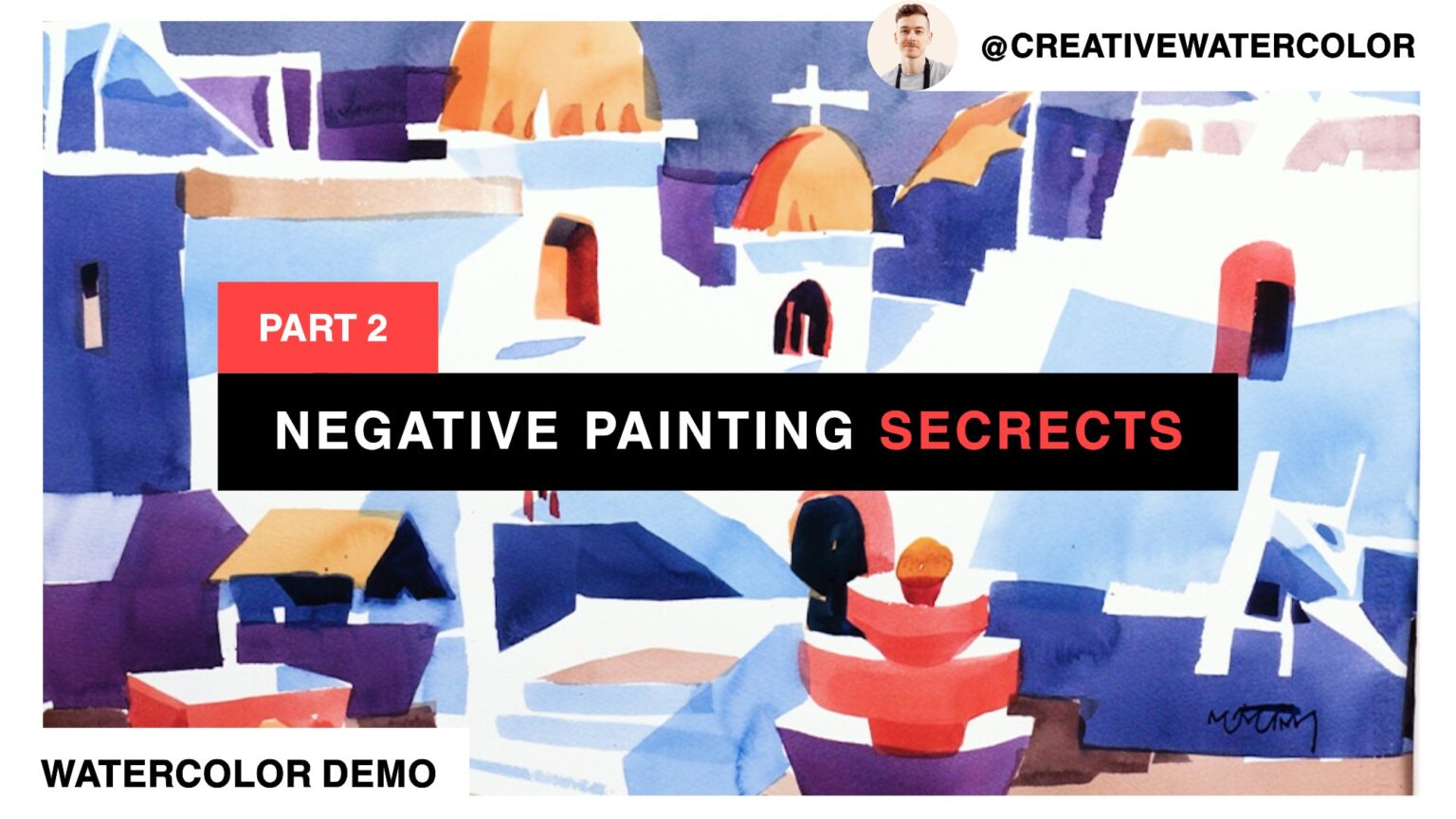
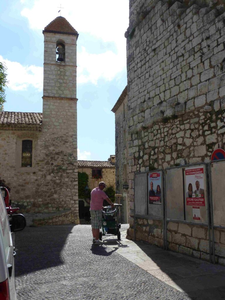
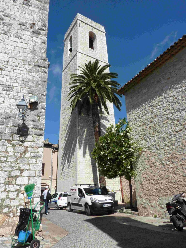
Secrets Of NEGATIVE Painting In WATERCOLOR - Reference Images
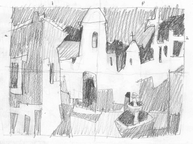
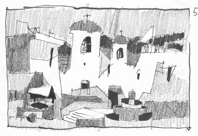
Secrets Of NEGATIVE Painting In WATERCOLOR - The Lesson
Hello everyone and welcome back to my studio.
In this second part of our demonstration painting we continue developing our work further.
The focus of today’s lesson is negative painting. Contrary to its name, negative painting is in fact very good, important skill. You can think of positive and negative painting as space occupied against space unoccupied.
When you make a stroke on a sheet of paper, the stroke itself becomes a positive shape and occupies positive space, while the space around your brushstroke is called negative space.
Most paintings feature a combination of these two approaches and you’re likely doing it even if you never thought about it consciously. But as with anything we do, unaware or not, whether we succeed or not becomes a question of chance.
To understand the role and importance of negative space we may want to look at painting, if even just for a minute, as a mosaic. A mosaic is a decorative pattern usually made of stone or tile pieces fastened on a surface, resulting in a configuration of colorful shapes.
Undoubtedly, when making a mosaic we would carefully consider each piece. But when painting, because of association with real life scenery, we tend to perceive some shapes as more important, some as less important.
The most obvious example would be a sky. We often treat the sky as a backdrop and seldom consider that it’s a shape in its own right. This happens because the subject that lies in front of the sky plane is the positive shape of import and we simply tend to neglect the negative space around it – our sky.
All shapes in a painting should be sufficiently varied and interesting. They should have affinity for each other.
You can also think of shapes in a painting as a jigsaw puzzle, where adjacent pieces fit together by way of interlocking. This kind of thinking is what guides my brushstrokes throughout this painting. I appraise each brushstroke in terms of the negative space around it.
I approach my composition in a manner a sculptor may approach a block of marble. I try to see the shape that remains. In other words, I focus on the negative space.
While quality of a shape is an objective property, the way you put shapes together is very personal. Each of us work from a set of preferences, innate or acquired.
Each of us infuses our work with the unique flavor that reflects the qualities we hold dear. As a result, we should remain true to our preferences in terms of our style and the look of our paintings, while try our best to improve upon the quality of our shapes.
Next time you paint try to consider your negative shapes. Make your sky shape more interesting. Don’t make it one big rectangle. Style is personal and it is to be cherished because it reflects who we are.
Shape quality is objective and measurable. Don’t approach it carelessly. Consider it in your work, there’s nothing to lose but everything to gain.
That’s all for today’s lesson. I hope you enjoyed it and learned something new. If you did, please leave a like, comment and subscribe. Each and every like and comment help tremendously. The best thing about it is that they cost you nothing. If you read this far thank you! I appreciate your time spent watching and I’ll see you in the next one!