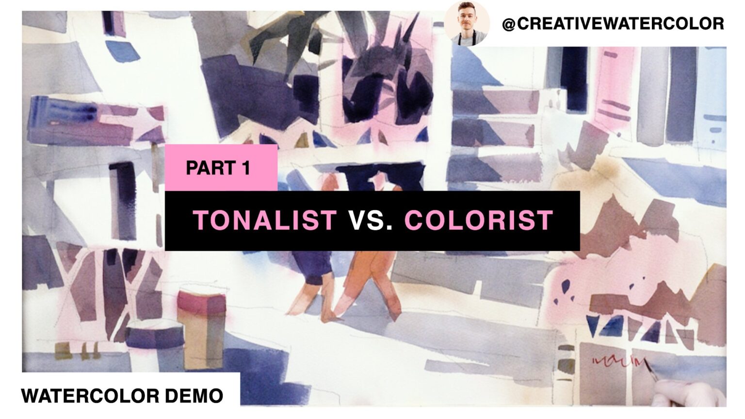
Watercolor rendering technique tone vs. color. In this video demo and lesson we’re going to discuss the difference between approaching rendering through tone and color.
Watercolor Rendering Technique TONE Vs. COLOR - Material List
Paints
- Winsor & Newton Winsor Yellow
- Winsor & Newton Winsor Yellow Deep
- American Journey Halloween Orange
- Daniel Smith Pyrrol Red
- Winsor & Newton Permanent Rose
- Winsor & Newton Permanent Alizarin Crimson
- American Journey Joe’s Green
- American Journey Cerulean Blue
- American Journey Cobalt Blue
- Winsor & Newton Winsor Blue Green Shade
- Holbein Permanent Violet
Brushes
- Winsor & Newton One Stroke Sable ½”
- Winsor & Newton Series 995 Synthetic 1″
- Robert Simmons Skyflow Synthetic 2″
- Robert Simmons Skyflow White Sable 1½”
- Rosemary & Co Pure Sable Series 90 #6
Paper
- Saunders Waterford 140lb Cold Press, 15″ x 22″
Watercolor Rendering Technique TONE Vs. COLOR - Reference Images
Watercolor Rendering Technique TONE Vs. COLOR - The Lesson
Hello everyone and welcome back to my studio for another exciting week of watercolor painting!
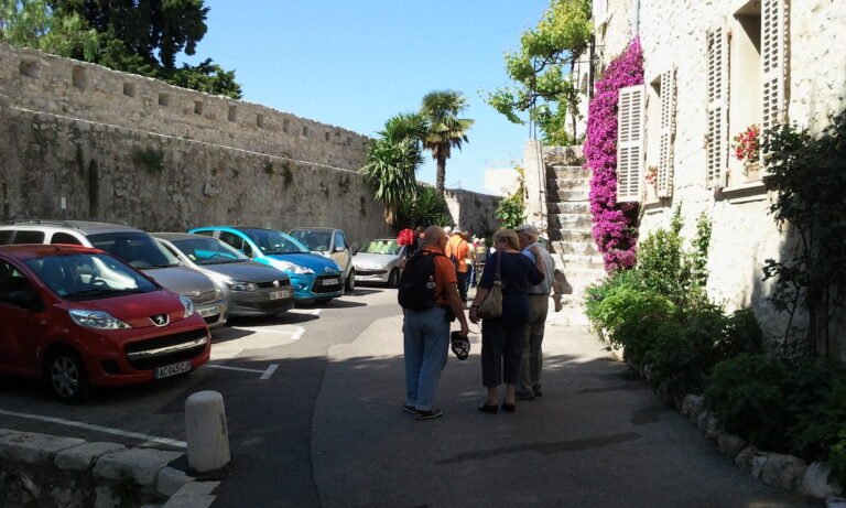
This time we’re visiting the southern coast of France. The French Riviera is a very beautiful and famous place. My relationship with the area began with books I’ve read in my youth, reinforced by my fondness of early 20th century French painters.
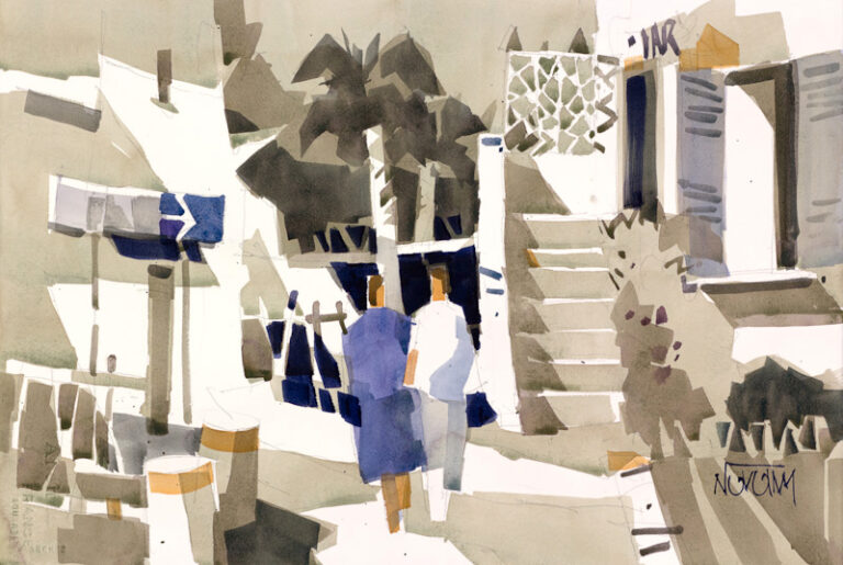
This painting is based on a scene from the famous little town of Saint Paul de Vence, the meeting place of artists like Matisse, Picasso and Chagall.
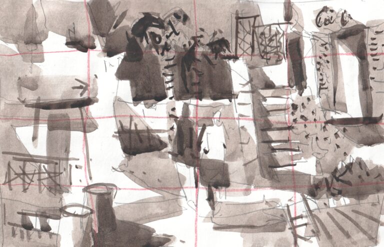
I made the design for this painting back in 2012. The idea behind it was to capture a very unassuming part of the town, not unique or especially beautiful, perhaps in a way similar to how the French painters of the early last century framed their paintings.
My next idea was to position the figures inside the composition in a way that is normally considered a big no-no: dead center. To counterbalance this awkward position I created such a pattern around the figures that counteracts this problem. Why did I decide to place them in such position in the first place? Because as artists, we can do anything and we should not only challenge convention, but ourselves.
My earlier renditions of the subject were satisfactory. However, returning to it after more than a decade reveals to me still more potential. My aim in this painting is to further explore color and its relationship to value, show you how I approach figures in a landscape, and share some tips that you can apply in your own paintings.
The title of this week’s painting comes from the gesture of my figures, which I feel is representative of the nature of the people of the Mediterranean.
There are two general approaches to rendering a scene:
- rendering through the use of value (a tonalist approach) and
- color (a colorist approach).
Generally speaking, tonalist approach relies on tonal value (a range of values from light to dark) to render objects. Technically, color is not necessary for successful execution of tonal painting. A painting can be painted monochromatically (using one color) and be perfectly readable. When painting representationally (from observation) this is the approach we use to render our scene. This reflects the way we perceive objects in space in real life. Even though we see color, our brain perceives the color’s inherent tonal value to give us the necessary information about the object’s position in space (together with size). That way we understand its relative position to other objects and to us. In fact, you may have been encouraged by your teacher or a book when starting out to paint using one color, like Umber or Black. Such color is able to produce full value range from light values all the way to darks.
The other approach, rendering objects through the use of color, makes use of temperature contrast of warm and cool colors. This way a more sensitive color rendition is possible, because value doesn’t “interfere”. Color can be glaring bright, even garish (Fauvist movement) or more refined. At the same time, greater color sensitivity is necessary and far better understanding of color is required.
While I’m adamant when it comes to the proper use of tonal value, color has a very important place in my work. I’d say that my approach is a hybridization of the two. Most art combines these two approaches, though extreme ends on either side of the spectrum are viable ways to make art.
In such case, the tonalist’s goal is to render the scene with values, relegating color to a supporting role where it becomes simply means to an end.
A colorist, on the other hand focuses purely on color expression, either suppressing value differentiation or working with inherent tonality of the color at full strength.
When deciding on the color strategy for today’s painting I wanted to use color in a way that supports the idea of the French Riviera, its lighthearted people and the sunny, sparkling atmosphere of the French coast. I also felt inspired by the French painters who loved painting and living here, such as Raoul Dufy and Henry Matisse. I also thought about the music of my favorite composer Eric Satie. To put it in other words, the ideas of lightness, jewel-like patches of color, dancing musical notes and poetic storytelling came to mind.
For further details please tune in to my next video where we’ll dive into more detail on how I achieve these ideas.