
How to paint with primary triad creatively in watercolor? In today’s tutorial I show you how I use this color scheme to produce colorful but balanced painting that is surprisingly colorful.
In today’s demonstration I am not necessarily focusing on anything in particular. But you can notice from my approach that I am following two principles.
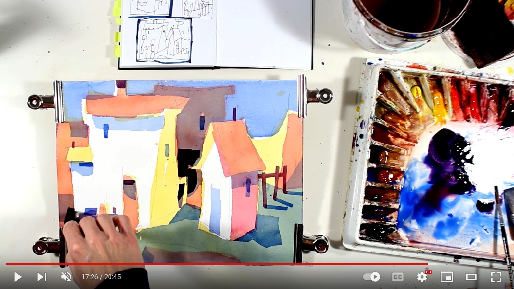
Firstly, I am building my painting in transparent layers. I am reserving my whites early on and I paint around them negatively. The painting’s structure relies on middle value which encompasses the whites, with darks placed in such a way so they suggest the position of planes in space (suggests depth).
Secondly, I am using only the three basic primary colors: yellow, red and blue. I am overlapping these to create the secondaries: oranges, violets, greens and neutrals. I take care to reserve my optical grey for my background shape, which has two functions. It provides relief and balance to the overall bright color scheme and also suggests depth by the relative color temperature difference.